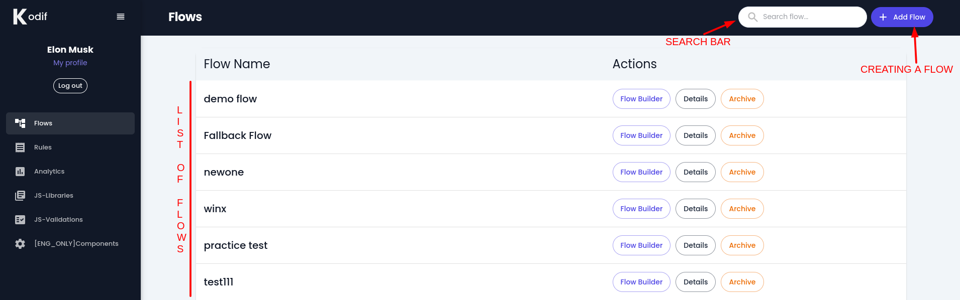
Introduction to main page
When you log in to your Kodif account, you will see the left-side menu and the main page for flows.
On the left bar menu, there are:
- Flows
- Rules
- Analytics
- JS-Libraries
- JS-Validations
- Components
On the main page of the flow, you can create and search for a flow.
Also, you can access all the flows that were already created.
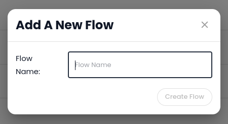
Creating a flow
When you press "Add Flow" button, you will see a pop-up window.
Write the name of the flow and press "Create Flow".
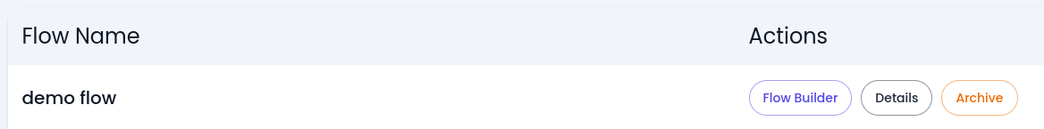
Later you will see created flow in the list of flows.
The created flow has three buttons: Flow Builder, Details, and Archive buttons.
- Flow builder is responsible for all manipulations of the nodes and versions, such as creating, cloning, saving, editing, etc.
- Details are responsible for the flow itself, such as editing the name of the flow, activating versions, adding global styles, enabling language translation support, etc.
- Archive is for deleting the flow.
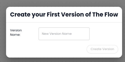
1. Flow Builder
If it is a newly created flow, you will see a pop-up window that will ask for a name of the version.
Write any name (for.ex: v1) and press Create Version button.
Then the system will ask to input any node. Press any node, later you can add, delete, and update those nodes as needed.
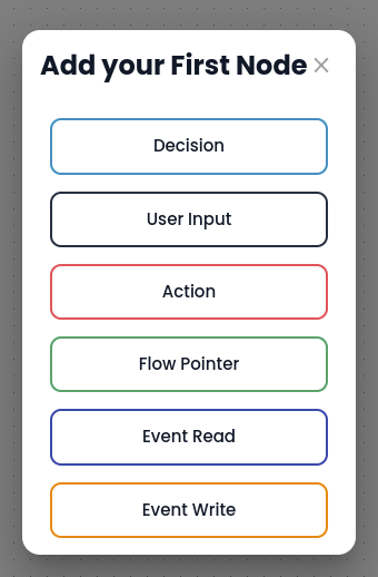
There are six types of nodes: Decision, User Input, Action, Flow Pointer, Even Read, and Event Write.
More info about nodes you will find in this article
Flow builder looks like as following: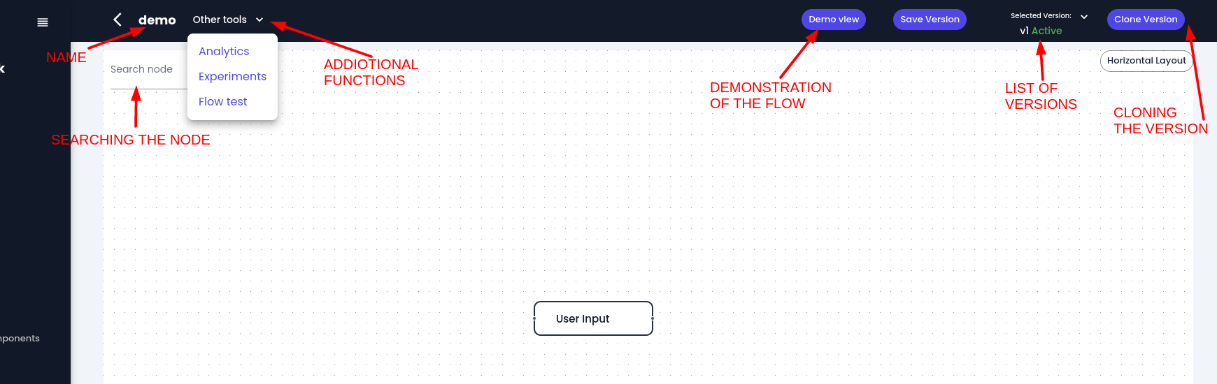
Let's go through each button
- Back button - to go back to list of the flows
- Name of the flow which is editable.
- Other tools [more information you will find in this article]()
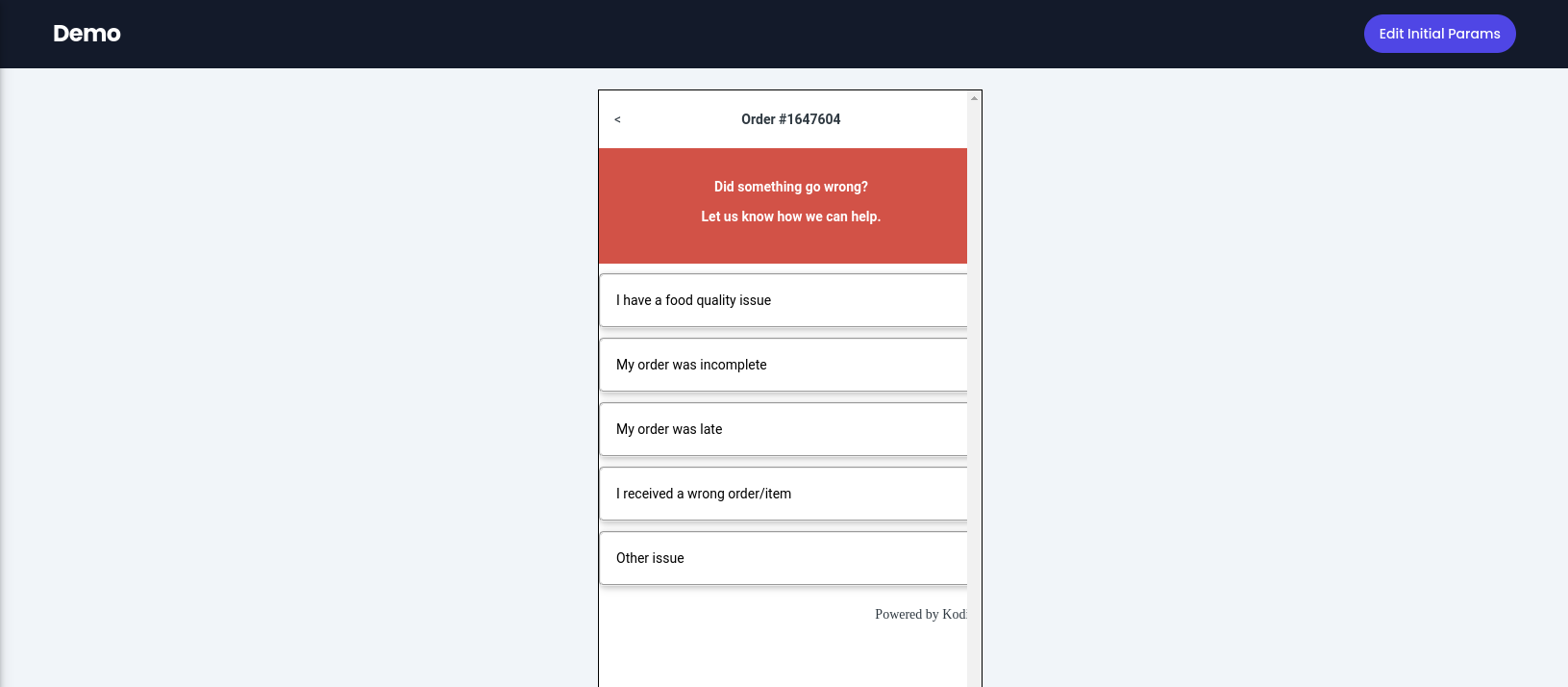
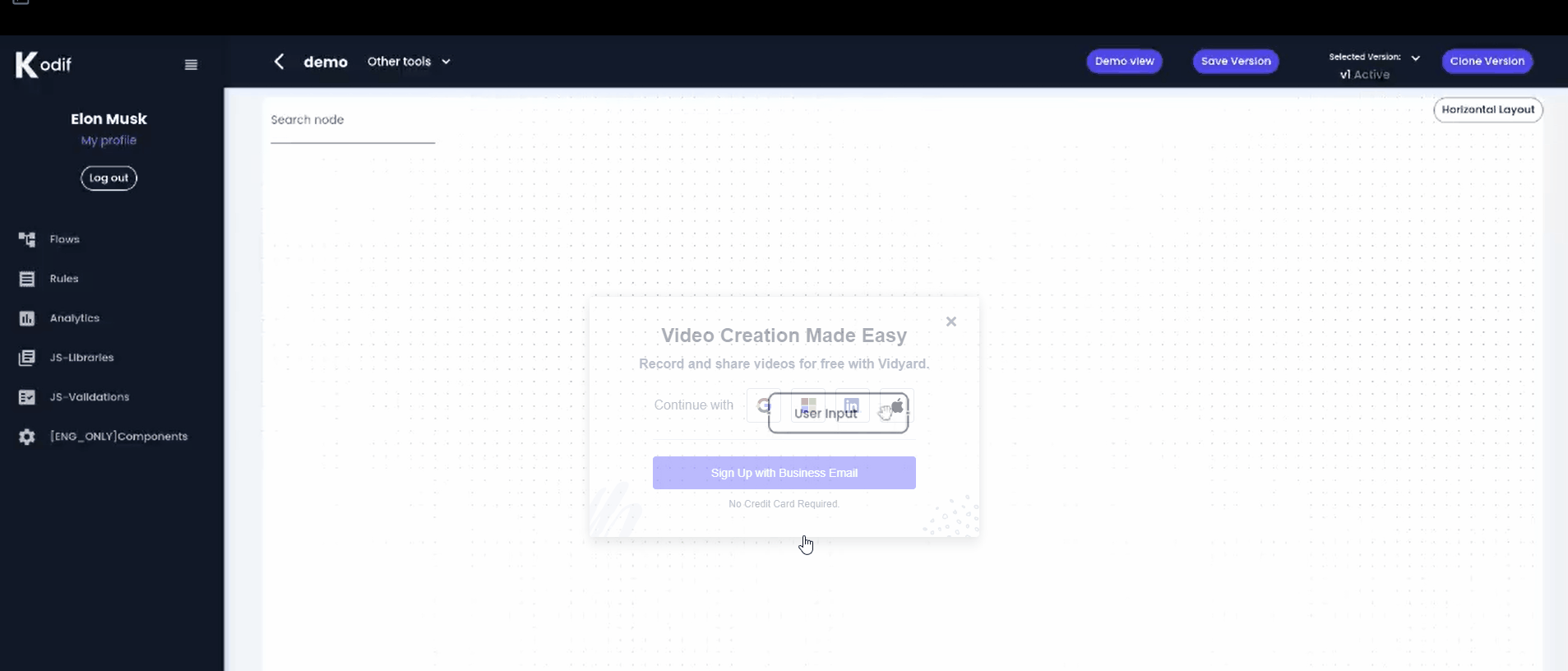
- Demo view - to see overall functionality and view of the flow
Press "demo view" button, and demo will be open in new window:
- Save version - to save the edited version.
If you have added new nodes and refreshed the page, your flow will not be saved. To save it, you should press the 'Save version' button.
- Selected version - shows list of versions
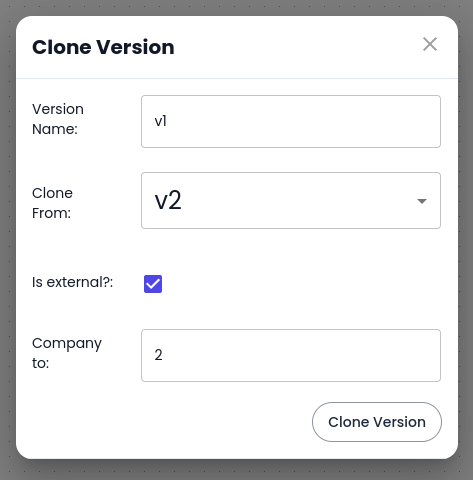
- Clone version button will show the following pop-up view:
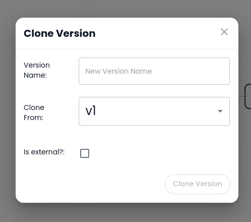
Write version name (ex.: v2) and press "Clone Version". It will create the second version of the selected version. It is useful when you need to update some functionality without touching the original version.
If you tick "Is external?" checkbox, the system will automatically select your company ID and create a new flow in your account.
8. Horizontal Layout
If you create unaligned nodes and you don't like how it is structured, press "Horizontal view" and it will align your nodes properly.
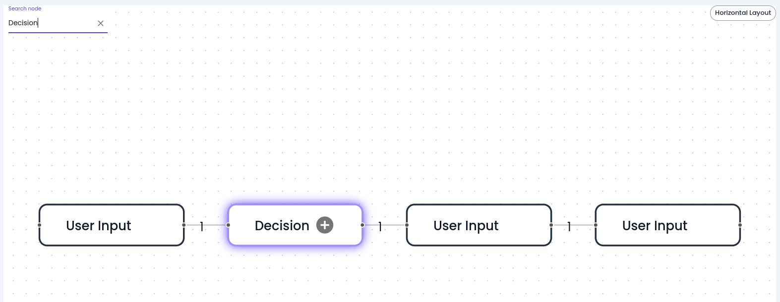
- Search Node
Type the name of the node you search for, and it will show that node with the purple color.
2. Details
The Details page looks like as below:
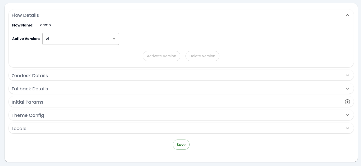
- Flow detail tab
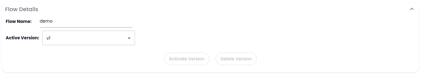
- Flow name - to edit name of the flow
- Active version - you can activate or delete versions by selecting them from the dropdown.
- Zendesk details tab (add more info here)

- Fallback Details tab

Is this a fallback flow? - to define that the flow is fallback
Fallback Flow - from the dropdown choose a desired flow
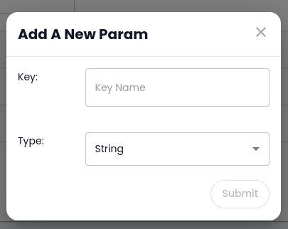
- Initial Params tab

It is needed to get specific data from the API.
For example: let's say we have an API that searches orders by customer ID and order ID. So, to get orders from that customer and see the demo of the flow, you need to write initial parameters.
To add parameters press "+" button, and you will see the pop-up window as following:
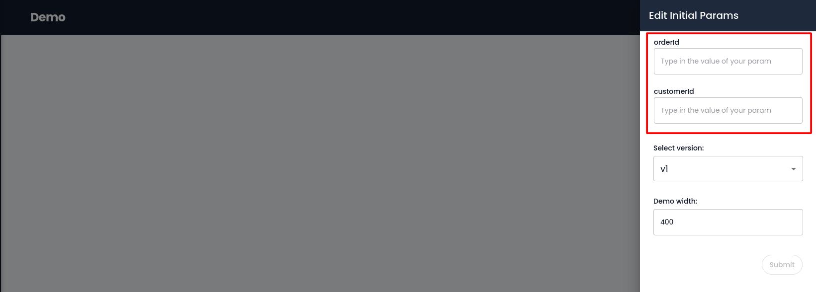
When you add them, you will see the list of parameters.

You can edit, delete or add by pressing "brush", "trash", "+" buttons.
Later these parameters will appear when you want to see "demo" of the flow.
- Theme config tab
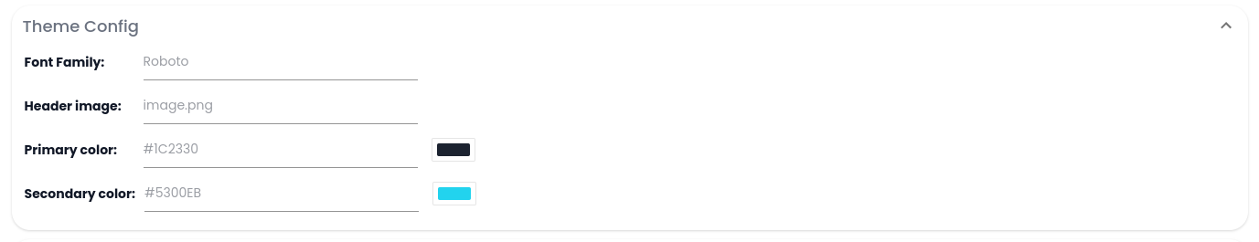
It is the global styling of the flow.
If you apply Font Family as Roboto, all text styles will be in Roboto font. However, if you want to change the font of a specific text, you can change it locally in the UI builder.
- Header image (more info needed)
- Primary color (more info needed)
- Secondary color (more info needed)
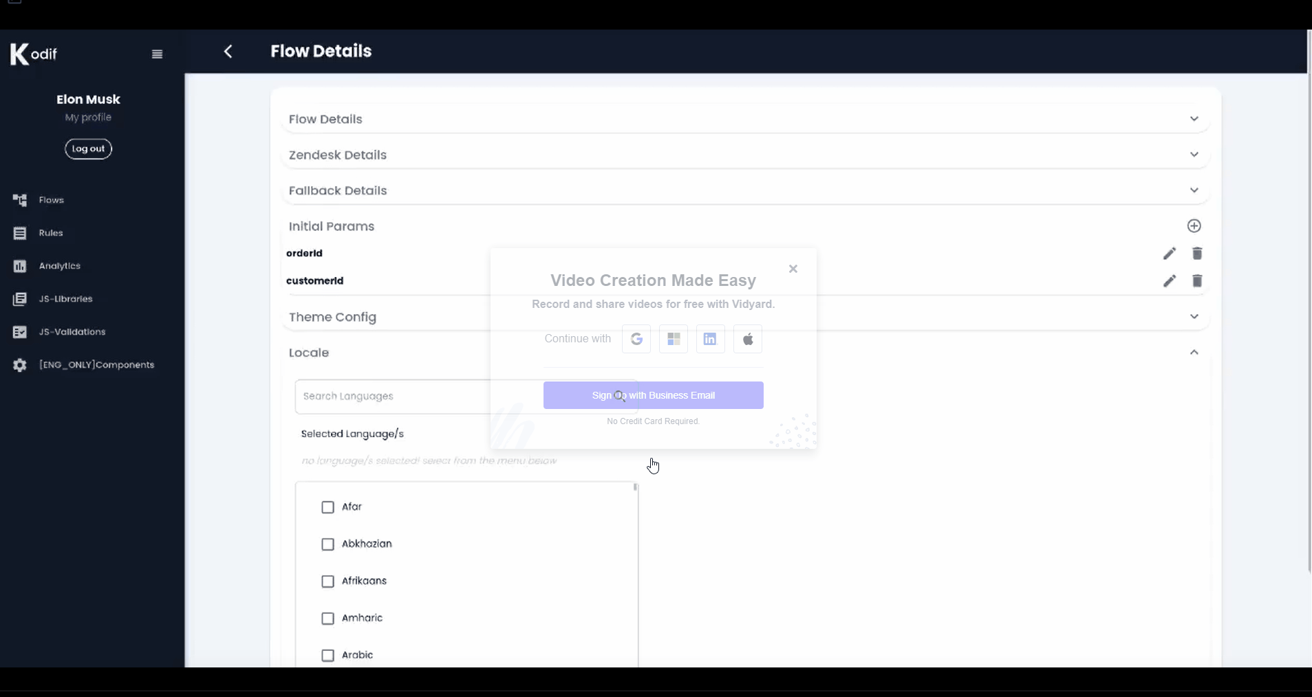
- Locale tab
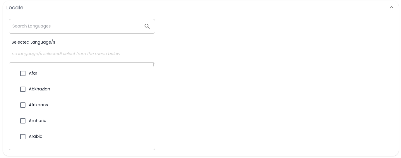
Local tab is used for adding language support. Your app, by default, can be in English and translated into any other language.
To add languages, search for the desired language, tick the checkbox and save. Later, if you don't need that language, you can delete it from the selected language list.
3. Archive
When you press "Archive" button, a confirmation pop-up window will appear as following:
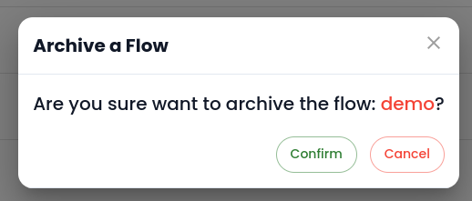
You can "Confirm" or "Cancel" deleting the flow.